Backend
PHPLaravelMVCREST/API Integration
Junior Laravel Full Stack Developer
Mahasiswa D3 Teknologi Informasi Universitas Brawijaya yang fokus pada pengembangan web fullstack menggunakan Laravel, PHP, MySQL, JavaScript, REST API, dan antarmuka web responsif.
Malang, Jawa Timur
D3 Teknologi Informasi, Universitas Brawijaya
akbarsalahudinpurnomo@gmail.com+62 877 8472 7890D3 TI
Universitas Brawijaya
3.85
IPK terakhir
3
Project full stack
Laravel
Stack utama
Keahlian Teknis
Saya biasa membangun fitur web dengan Laravel, menyusun data di MySQL, lalu merapikan tampilan memakai Blade, HTML, CSS, dan JavaScript. Setelah semuanya siap, saya sinkronkan ke GitHub, lalu deploy ke Railway atau Vercel.
Pengalaman Proyek
Beberapa project favorit saya:
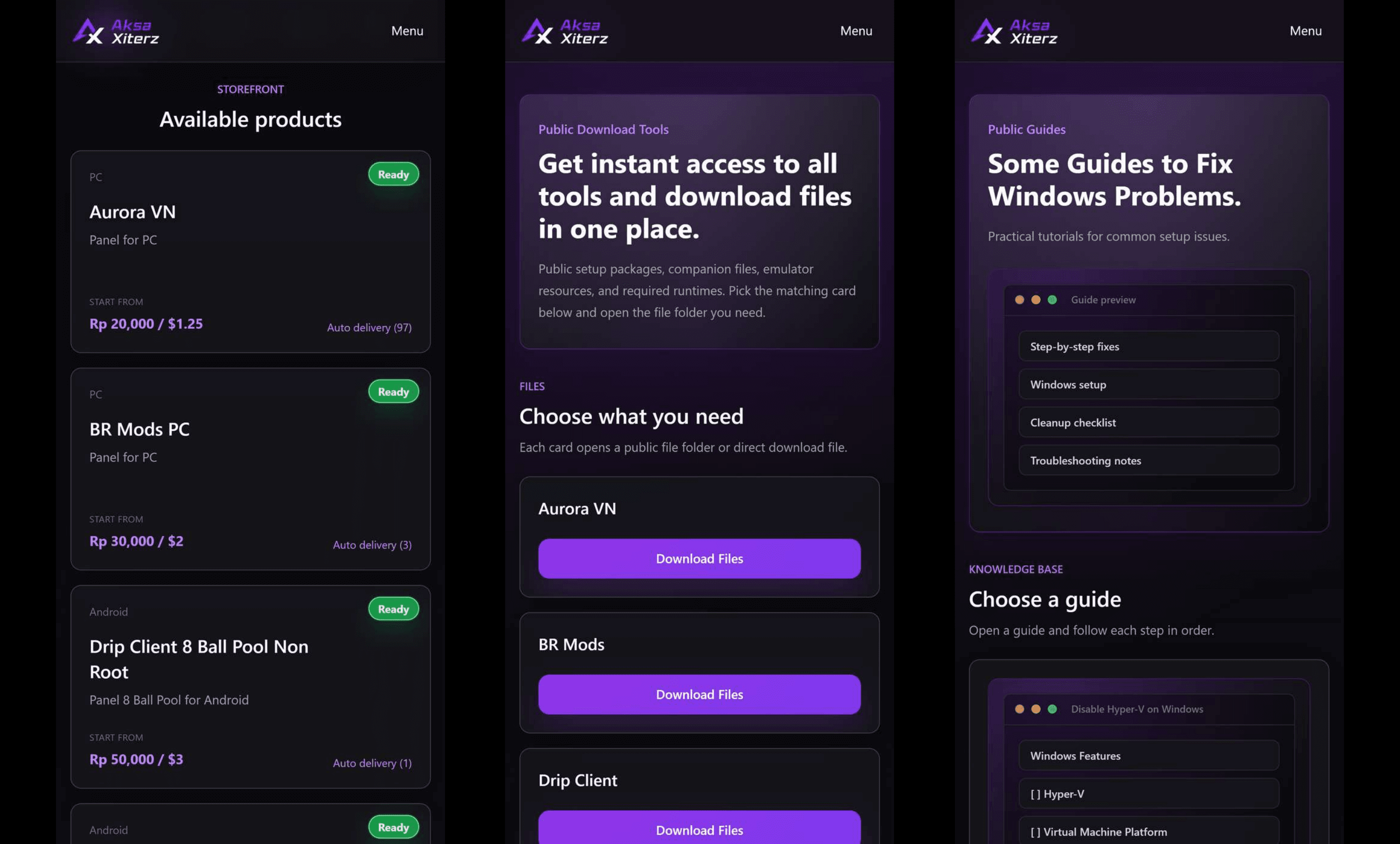
Digital License Storefront
Fokus project
Storefront lisensi digital dengan katalog, paket lisensi, cart checkout, voucher, riwayat pesanan, multi-payment, dan auto-delivery license key.
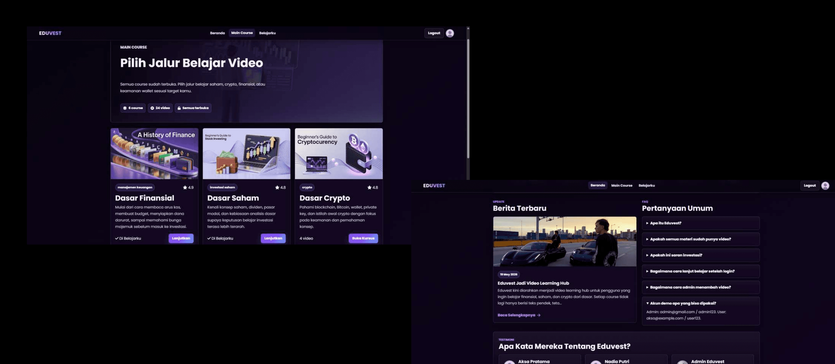
Video Learning Platform
Fokus project
Platform pembelajaran investasi saham dan kripto dengan autentikasi multi-user, course library, course detail, dashboard pengguna, profile, dan news page.
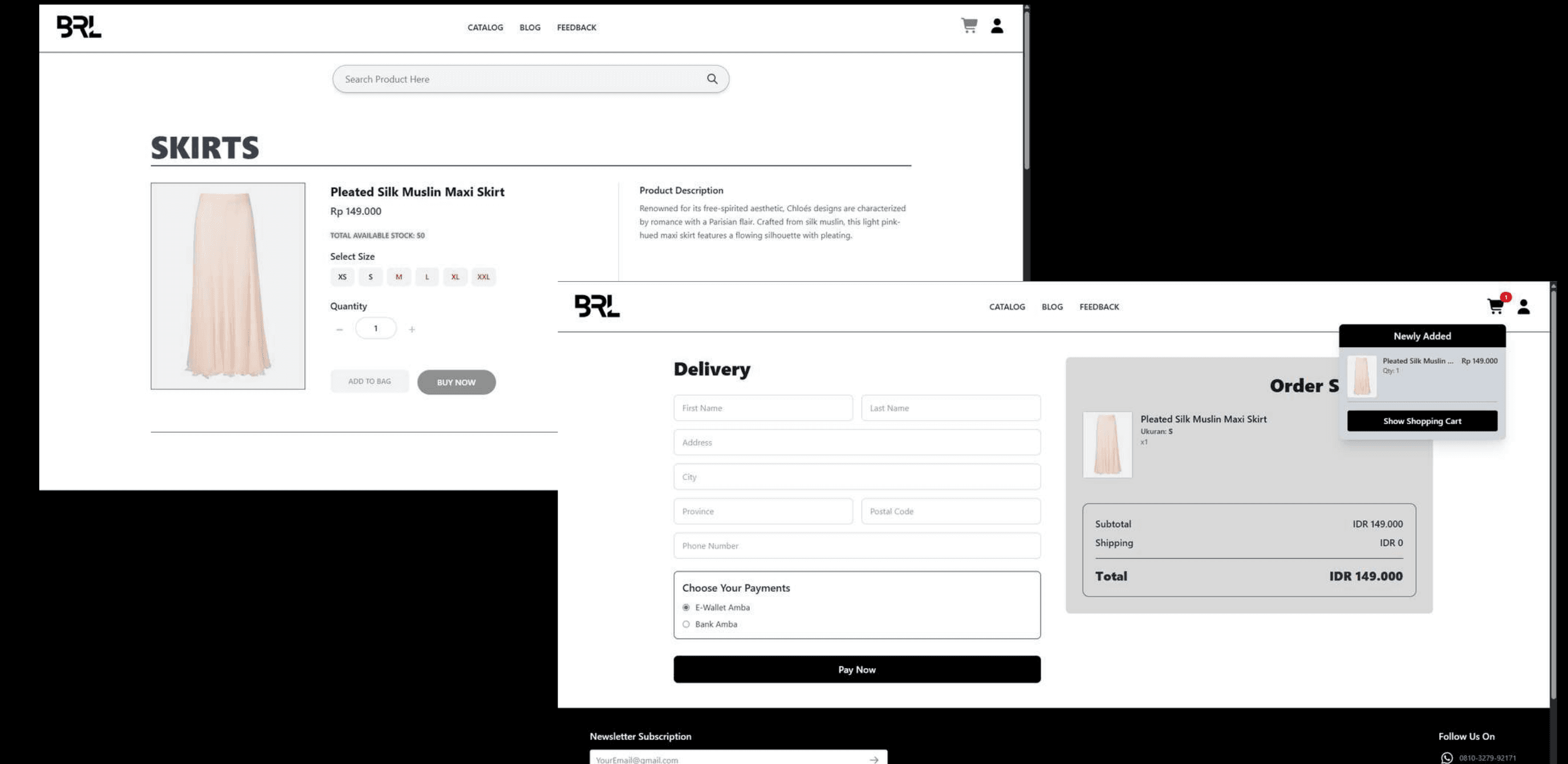
Fashion E-Commerce
Fokus project
Website e-commerce fashion dengan katalog produk, detail produk, cart, buy now, checkout, proses pembayaran, dan admin panel.
Saya mencari kesempatan internship untuk mengembangkan kemampuan pengembangan aplikasi web secara lebih profesional.